About the Project
GenAI is an online platform dedicated to AI ethics, featuring articles by insightful thinkers who examine the field from multiple perspectives.
When designing the logo, I aimed to balance seriousness and respectability with an edgy, innovative feel. The design needed to be elegant, clear, and simple, yet memorable and distinct.
I developed three concepts to address these goals from different perspectives, and to visually engage with the fundamental issues at the heart of AI discourse.
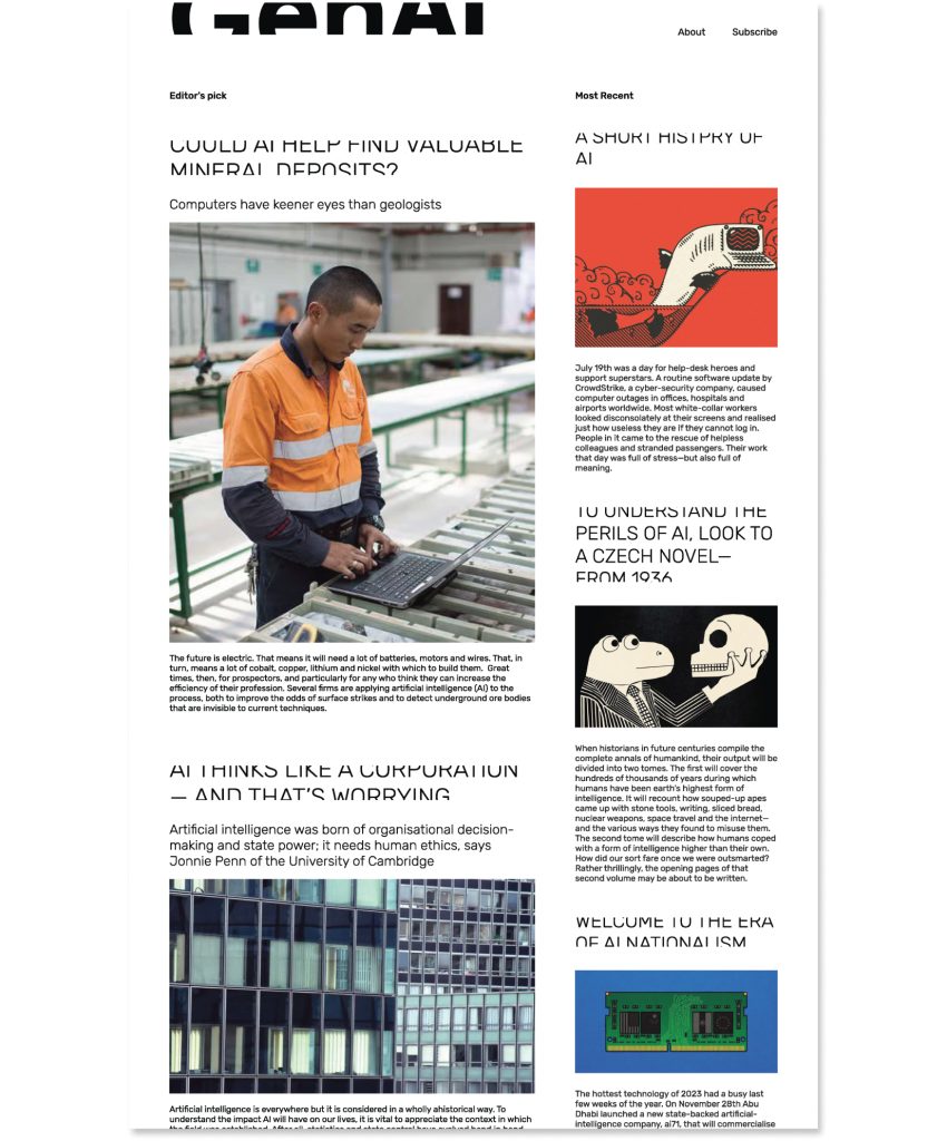
I also designed the layout for the online platform.

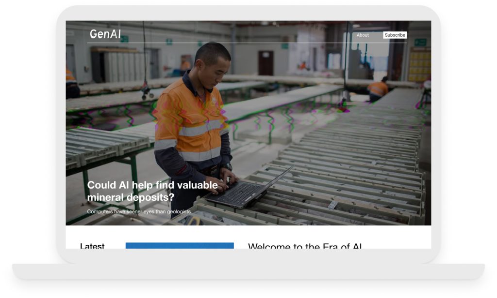
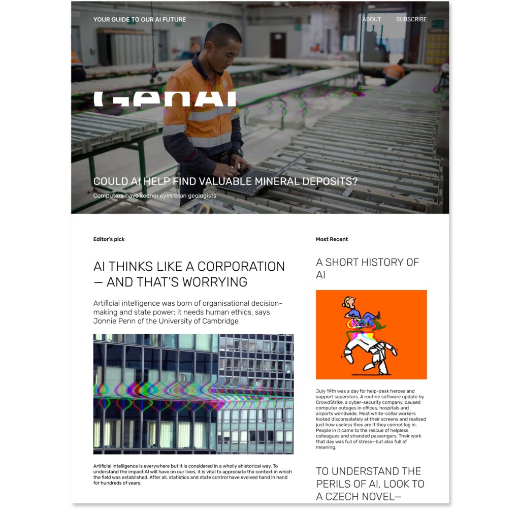
Concept A: Glitch
Dynamic | Risk-taking | Random vs Controlled
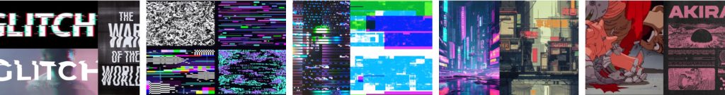
I was inspired by Cyberpunk aesthetics and Japanese manga, with their hi-tech urbanism, shimmering neon lights, futuristic color palettes, and dystopian backdrops. These two visual genres raise questions about the tension between humans and machines – examining how much control humans have over AI and how much autonomy it possesses.
My goal was to visually convey this concept by applying a glitch effect to the logo, and by using a code-generated glitch effect on the images.
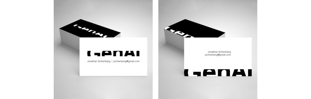
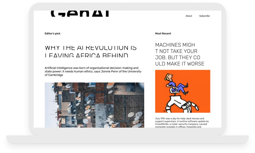
Concept B: Disruption
Mystery | “Peephole” | Expanding | Non-conforming
AI is disruptive. It changes how we do things, how we interact with others, and how we perceive the world. It also challenges the way we think, and raises many questions with unknown answers.
This logo makes you pause. It simultaneously expands beyond its boundaries while hiding behind a peephole. For the website, I envisioned using code to randomly cut titles mid-word or use negative margins to crop them for a similarly arresting visual effect.
Concept C: Retro Futurism
Classic | Nostalgic | Optimistic | Ironic
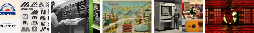
We often envision the future through the lens of the past, which limits our imagination. This brings both fear and relief—we can’t fully grasp the grave implications of this technology. At the same time, if our imagination is limited, aren’t machines as well?
I used the classic font Futura featured on the poster for Kubrick’s 2001: A Space Odyssey, where the first popular embodiment of AI was introduced into visual culture. For the website’s titles, I chose Eurostile, the typeface used on the Pan Am spacecraft’s flight deck in the film. Just for fun, I also incorporated an element from the logo into the website’s layout.